
Let’s have a moment of radical honesty: Having a “pretty” website in 2026 is the equivalent of having a sleek, designer business card sitting at the bottom of a drawer. It looks nice, it cost you a bit of money, but it’s not doing any actual work.
Most business owners are taught that a website is a destination—a place where people go to “find” them. But in a world where attention spans are shorter than a TikTok transition, a destination isn’t enough. You don’t need a digital landmark; you need a conversion system.
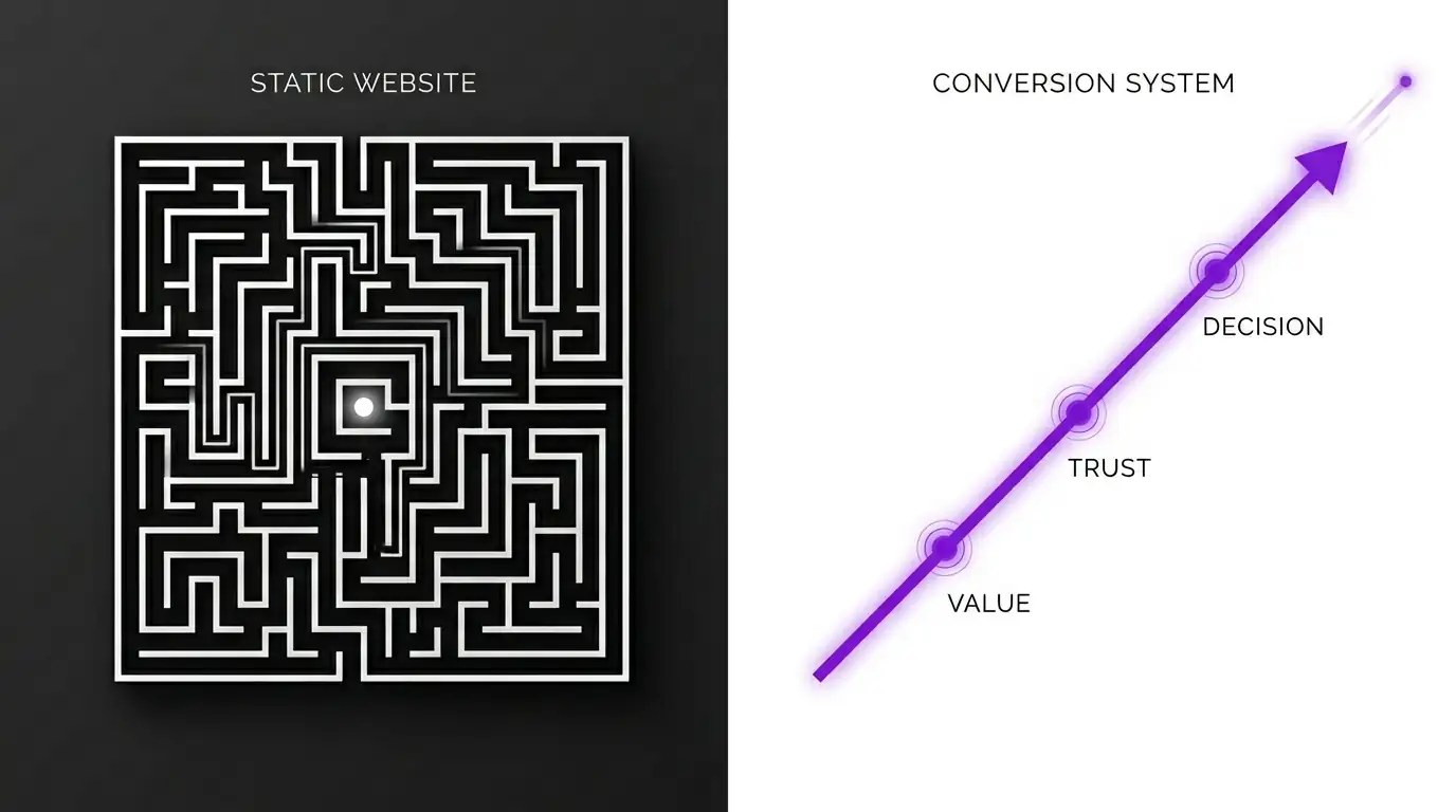
The Fatal Flaw of the “Digital Brochure”
The traditional website is passive. It sits there, waiting for a visitor to land on the homepage, navigate an “About” page, browse some services, and—if the stars align—find the “Contact Us” button.
The problem? Humans are distractible.
If you leave the journey up to the user, they will get lost. They’ll get a notification, their coffee will boil over, or they’ll simply get bored and click away. A static website is a library; a conversion system is a tour guide. One offers information; the other offers a path.
What Exactly is a Conversion System?
A conversion system is a strategic sequence designed to move a stranger through a specific psychological journey. It’s not just code and images; it’s engineered behavior.
While a website focuses on what you do, a conversion system focuses on who the customer becomes after using your product. Here is how the two differ:
| Feature | Passive Website | Active Conversion System |
| Focus | Company History / “About Us” | Problem Solving / Customer Needs |
| Navigation | Multiple tabs (Paradox of Choice) | Linear path (Single Call to Action) |
| Follow-up | Hope they come back | Automated Email/SMS Nurturing |
| Goal | General Awareness | Specific Transaction or Lead Capture |
The Four Pillars of a High-Performing System
If you want to stop losing leads to the “back” button, you need to implement these four elements immediately:
1. The Value Hook (Lead Magnet)
Stop asking people to “Subscribe to our newsletter.” No one wants more clutter in their inbox. Instead, offer a specific solution to a small problem. Whether it’s a PDF guide, a free audit, or a discount code, your system must exchange value for contact information.
2. The Guided Journey (Landing Pages)
Instead of sending all your traffic to a cluttered homepage, send them to dedicated landing pages. If you run an ad for “Blue Widgets,” that user should land on a page that only talks about Blue Widgets. Remove the header menu. Remove the footer. Keep the focus on the one action you want them to take.
3. The Nurture Engine
Most people won’t buy on the first visit. A conversion system acknowledges this by using automated follow-ups. Whether it’s an email sequence that addresses common objections or a retargeting pixel that shows them helpful content on social media, your system keeps the conversation going while you sleep.
4. Frictionless Conversion
The “Contact Us” form is where sales go to die. Make it easy. Use calendar embeds (like Calendly), “Buy Now” buttons that support Apple Pay/Google Pay, or AI chatbots that can qualify a lead in real-time.
Pro Tip: If your checkout or contact process takes more than three clicks, you are literally paying a “complexity tax” in lost revenue.
Making the Shift
Investing in a website redesign often feels like a vanity project. Investing in a conversion system is a growth strategy. When you stop worrying about how your site “looks” and start focusing on how it “performs,” your metrics will shift from vanity (page views) to sanity (ROI).
Don’t build a digital monument. Build an engine.